

Blueair
Redesigning the Blueair application to provide a better customer experience for people owning air purifiers in their homes or workplaces.

Blueair
Redesigning the Blueair application to provide a better customer experience for people owning air purifiers in their homes or workplaces.
Project goal
Bringing up App Store ratings
The client clearly defined the goal. They would like a brand new app in the App Store and Google Play Store with an average rating higher than 4.0 (the previous version got less than 1.5 in some countries). This app has to be ready by the beginning of the second fiscal quarter to complement Blueair’s release of a new, cutting-edge air purifier product family while also being compatible with legacy products.

Blueair air purifier
Research
Research
Research


Usertesting the physical and digital product ondboarding with the previous app.
Culture and pollution history greatly influences how people use air purifiers.
Culture and pollution history greatly influences how people use air purifiers.
Culture and pollution history greatly influences how people use air purifiers.
Getting to know our audience
Turning the Chinese and US customer base into effective personas
The target audience was incredibly diverse, with the two most crucial segments being the most distinct, namely China and the USA.
One of the most characteristic differences were how many times people want to interact with their air purifier to make sure it is doing its job.
Many users told us that they would prefer a one-button app that can help to forget about air quality. On the other hand, many people want to make sure that they are making the most of a machine seen as an investment for their health and well-being. The latter group also uses the same air purifier in different rooms throughout the day, monitoring when indoor pollution drops to an acceptable level before moving in.
“Air pollution is invisible; air purifiers are loud. How do we prove that it’s worth it to turn them on?”
“Air pollution is invisible; air purifiers are loud. How do we prove that it’s worth it to turn them on?”
“Air pollution is invisible; air purifiers are loud. How do we prove that it’s worth it to turn them on?”


2 high level customer journey in order to lay out the most important differences between the US and China markets’ customer experiences.
Design
Design
Design
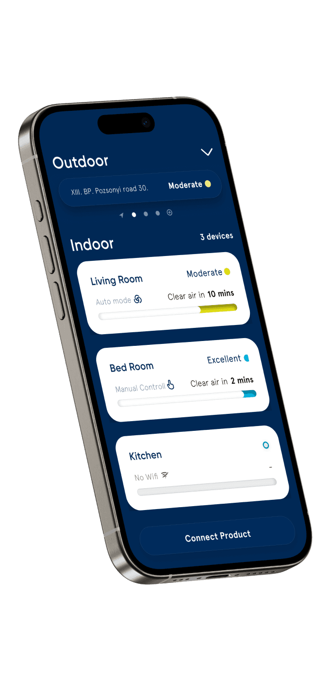
Single Home Screen
Outdoor & indoor metrics
We placed the air purifier's performance in the context of indoor versus outdoor air quality to show the incredible performance these machines provide. This structure also encourages a more conscious device usage by letting the machine work only when necessary and making sure it did.
Intuitive correlation
There is a possibility of checking the history of performance to see how it correlates to outside air quality on the next screen and in more details by expanding sections.
Outdoor and indoor air quality are directly related and the machine's performance can only be evaluated in this context.


Late stage wireframes of home and product screen


Final UI design of home and product screen
Progressive disclosure
Learning about air quality to highlights its importance
Display different levels of information separately to avoid cognitive overload.
Information and actions are available on the home screen that covers this application's most crucial user cases. Detailed information about indoor and outdoor air quality is shown further down in the hierarchy, presenting information when and where it is needed to balance the cognitive load.
Learning about air quality helps people see the real value of air purifiers.

Most important info on home screen.

Metric specific charts a tap away.
Nevertheless, using them remains simple without having to learn.

Product page

In depth information under Read More.
Air quality details
Rich information at a glance, details one tap away
Users who have specific health reasons to become customers were conscious of the meaning of these values. For the rest, the colors indicate how the current AQI (cumulative value) is calculated.
Air quality details
Rich information at a glance, details one tap away
Users who have specific health reasons to become customers were conscious of the meaning of these values. For the rest, the colors indicate how the current AQI (cumulative value) is calculated.
Air quality details
Rich information at a glance, details one tap away
Users who have specific health reasons to become customers were conscious of the meaning of these values. For the rest, the colors indicate how the current AQI (cumulative value) is calculated.


Swipe for quick actions.
Interact with the air purifier quickly and efficiently
Interactions used multiple times a day like: turning the air purifier on and off or putting it in automatic and night mode is available by swiping the purifier's card on the home screen. Further actions and information are available after tapping the card.


A good case for neumorphic elements
Visual continuity between physical and digital interface
We used them in case of features available on the physical product to create a sense of oneness between the app and the air purifiers.
The application’s most important raison d’etre is to create a bridge between the physical air purifier device and the user. Neumorphic elements have a mix of physical and digital visual cues.


Neumorphism: A mix between skeumorphism (mimicking physical objects) and minimalism.
Communicating with colors, words, numbers, and shapes
Air quality is a relatively obscure science of which the understanding among the target audience varies a lot.
In China, air pollution has been part of everyday conversations for a long time, while in the US, the general understanding is not so high. Some of the most critical indicators have abbreviations only half of our users understand, but those who do expect to see them.
We relied heavily on colors, words, numbers, and graphs to put detailed air quality information in context, even for those who don’t understand the basics.
Educational material is also widely available in the app without overcrowding the most often used pages.

Assigning air purifier to geographic location
One at the office, one at home in the living room, one in the kitchen
Comparing indoor and outdoor air quality to see the value our air purifiers provide reassures our users that they made the right buying decision while also informing them when it is useful to turn the device on or not.
While in some countries, air purifiers are a relatively rare occurrence, in others where air pollution is rampant, they are part of everyday life. As so, a single user might operate multiple devices in different locations. At home, at the workplace, and maybe at their vacation home too.
We challenged ourselves to design an easy way to tell the app what location a purifier is located so that we can overlay indoor and outdoor air quality graphs.
Users can either assign a location to the air purifier on the device-specific product page or appoint one or more air purifiers to a single location on the map.
Assign location
Assign device
View at the same time

Assign location
Assign device
Outdoor and indoor air quality on the same graph
Assign location
Assign device
View at the same time
Estimated Time Ahead for clean air
It depends on many factors
From all the different metrics we found that by far the most important for the majority of users is the “clean air ETA”
It was not evident though, how we should display this information for the user in a visual way. We talked through the different options to show with different stakeholders. We decided to use an absolute scale for showing the estimated time remaining while also showing current air quality with a background color.


Demonstration of different options to show air quality ETA visually.
Strategy
Lack of digital roadmap
When the project started, we had to make sure that we start delivering design as soon as possible. However, we always try to form a more strategic and longterm collaboration rather than a project-based one. We realised that there is no updated strategic roadmap available that focuses on the digital experience of Blueair. Their focus was on the physical design and engineering of their Purifier instead of the digital.
Ecological and social outlook
We grounded our roadmap in what we learned so far during the project about the users, the competitors, and the ecological and socio-cultural outlook of air purification and health sciences. After collecting all the features that we or any other stakeholder mentioned so far, we grouped the similar ones and created meaningful themes.
Anticipating opportunities
We used an effort-impact matrix to sort the themes based on how many resources we anticipate is needed for them versus how much value they provide to business and users. Having the themes weighted, we organized them with small overlapping areas after each other on the upcoming year's roadmap. After this, we defined the focus areas of digital development for each quarter. The closer they are to the present, the more certain, and further into the future, they are more assumptive and broad. When ready, we presented and handed over the roadmap to the team in Blueair.


Very high level roadmap containing themes to work on


3 Models that influenced our way of thinking:
The User Experience Pyramid, Kano model, and how uncertainty grows when we peer into the future.
Results
App Store rating 4+ in most regions
In spite of the technical challenges the platform faces an overwhelming amount of the comments regarding the UXUI are positive on the App Store
Daily active users increased (DAU+)
People use the application to control their air purifiers much more often since the new design was deployed.
Augmented reality platform
Making digital fashion more meaningful.

Product strategy
MVP
Engagement
2024
7 minutes to read

Converting users with different backgrounds
Web2.5 payment and account flow
Design
Research
Product strategy
2023
7 minutes to read
Product culture
Transforming a startup that worked as an agency to an organisation that places product & customers in the centre.
EdTech
CRO
Multi -language
2023
5 minutes to read

Onboarding novice traders
Promising crypto startup preparing for growth.

Design
Research
Product strategy
2020
10 minutes to read
Redesign for better conversion
An international higher education platform.
EdTech
CRO
Multi -language
2018
8 minutes to read
Augmented reality platform
Making digital fashion more meaningful.

Product strategy
MVP
Engagement
2024
7 minutes to read

Converting users with different backgrounds
Web2.5 payment and account flow
Design
Research
Product strategy
2023
7 minutes to read
Product culture
Transforming a startup that worked as an agency to an organisation that places product & customers in the centre.
EdTech
CRO
Multi -language
2023
5 minutes to read

Onboarding novice traders
Promising crypto startup preparing for growth.

Design
Research
Product strategy
2020
10 minutes to read

Redesign for better conversion
An international higher education platform.
EdTech
CRO
Multi -language
2018
8 minutes to read
Augmented reality platform
Making digital fashion more meaningful.

Product strategy
MVP
Engagement
2024
7 minutes to read

Converting users with different backgrounds
Web2.5 payment and account flow
Design
Research
Product strategy
2023
7 minutes to read
Product culture
Transforming a startup that worked as an agency to an organisation that places product & customers in the centre.
EdTech
CRO
Multi -language
2023
5 minutes to read

Onboarding novice traders
Promising crypto startup preparing for growth.

Design
Research
Product strategy
2020
10 minutes to read

Redesign for better conversion
An international higher education platform.
EdTech
CRO
Multi -language
2018
8 minutes to read
Augmented reality platform
Making digital fashion more meaningful.

Product strategy
MVP
Engagement
2024
7 minutes to read

Converting users with different backgrounds
Web2.5 payment and account flow
Design
Research
Product strategy
2023
7 minutes to read
Product culture
Transforming a startup that worked as an agency to an organisation that places product & customers in the centre.
EdTech
CRO
Multi -language
2023
5 minutes to read

Onboarding novice traders
Promising crypto startup preparing for growth.

Design
Research
Product strategy
2020
10 minutes to read

Redesign for better conversion
An international higher education platform.
EdTech
CRO
Multi -language
2018
8 minutes to read

Augmented reality platform
Converting users with different technological backgrounds
Product strategy
MVP
Engagement
Product culture
Transforming a startup that worked as an agency to an organisation that places product & customers in the centre.

Scrum
Leadership
Strategy

Converting users with different backgrounds
Web2.5 payment and account flow
Personas
Research
User maturity
Onboarding novice traders
Promising crypto startup preparing for growth.
Crypto
Trading
Growth


Redesign for better conversion
An international higher education platform.
EdTech
CRO
Multi -language

Augmented reality platform
Converting users with different technological backgrounds
Product strategy
MVP
Engagement
Product culture
Transforming a startup that worked as an agency to an organisation that places product & customers in the centre.

Scrum
Leadership
Strategy

Converting users with different backgrounds
Web2.5 payment and account flow
Personas
Research
User maturity
Onboarding novice traders
Promising crypto startup preparing for growth.
Crypto
Trading
Growth


Redesign for better conversion
An international higher education platform.
EdTech
CRO
Multi -language

Augmented reality platform
Converting users with different technological backgrounds
Product strategy
MVP
Engagement
Product culture
Transforming a startup that worked as an agency to an organisation that places product & customers in the centre.

Scrum
Leadership
Strategy

Converting users with different backgrounds
Web2.5 payment and account flow
Personas
Research
User maturity
Onboarding novice traders
Promising crypto startup preparing for growth.
Crypto
Trading
Growth


Redesign for better conversion
An international higher education platform.
EdTech
CRO
Multi -language

Augmented reality platform
Converting users with different technological backgrounds
Product strategy
MVP
Engagement
Product culture
Transforming a startup that worked as an agency to an organisation that places product & customers in the centre.

Scrum
Leadership
Strategy

Converting users with different backgrounds
Web2.5 payment and account flow
Personas
Research
User maturity
Onboarding novice traders
Promising crypto startup preparing for growth.
Crypto
Trading
Growth


Redesign for better conversion
An international higher education platform.
EdTech
CRO
Multi -language
More projects

Get in touch
Copy to clipboard
atsomos@gmail.com
+31683291846

Copy to clipboard
atsomos@gmail.com
+31683291846
Get in touch

Get in touch
Copy to clipboard
atsomos@gmail.com
+31683291846

Get in touch
Copy to clipboard
atsomos@gmail.com
+31683291846

