

Masterstudies
Strategic development of international higher education platform.
Project
Project
Project
Project
Masterstudies
Masterstudies is one of the most popular websites for helping international students find their next step in higher education. It is also translated to more than 40 languages for a global and young audience and used for more than a decade worldwide.
Masterstudies
Masterstudies is one of the most popular websites for helping international students find their next step in higher education. It is also translated to more than 40 languages for a global and young audience and used for more than a decade worldwide.
Masterstudies
Masterstudies is one of the most popular websites for helping international students find their next step in higher education. It is also translated to more than 40 languages for a global and young audience and used for more than a decade worldwide.
Masterstudies
Masterstudies is one of the most popular websites for helping international students find their next step in higher education. It is also translated to more than 40 languages for a global and young audience and used for more than a decade worldwide.
Goal
The client’s goal was to raise dwindling conversion rates on the site. We aimed to understand the underlying reasons for this decrease and propose a strategic, prioritized, full-scale design plan that solves the problems we unearthed and helps put the site back ahead of its competitors.
Goal
The client’s goal was to raise dwindling conversion rates on the site. We aimed to understand the underlying reasons for this decrease and propose a strategic, prioritized, full-scale design plan that solves the problems we unearthed and helps put the site back ahead of its competitors.
Goal
The client’s goal was to raise dwindling conversion rates on the site. We aimed to understand the underlying reasons for this decrease and propose a strategic, prioritized, full-scale design plan that solves the problems we unearthed and helps put the site back ahead of its competitors.
Goal
The client’s goal was to raise dwindling conversion rates on the site. We aimed to understand the underlying reasons for this decrease and propose a strategic, prioritized, full-scale design plan that solves the problems we unearthed and helps put the site back ahead of its competitors.
Results
Significant conversion rate increase
Students find and complete forms more easily
Lead quality increase
Students spam forms less and applly to courses more relevant to them on average.
Content page setup speed decrease
It is much easier to set up the universal contact page template
Scope
The first three months of a 7-month long design and research project for a higher education platform. Design efforts went further than the look and feel, so we had the chance to help the client create and implement a better value proposition for their users in the context of their competition.


Team
On our side, we had two designers and a researcher. We worked together with a diverse team of stakeholders who represented different perspectives from community management, content creation, marketing, and sales to linguistics, and strategic development.
Team
On our side, we had two designers and a researcher. We worked together with a diverse team of stakeholders who represented different perspectives from community management, content creation, marketing, and sales to linguistics, and strategic development.
Team
On our side, we had two designers and a researcher. We worked together with a diverse team of stakeholders who represented different perspectives from community management, content creation, marketing, and sales to linguistics, and strategic development.
Team
On our side, we had two designers and a researcher. We worked together with a diverse team of stakeholders who represented different perspectives from community management, content creation, marketing, and sales to linguistics, and strategic development.
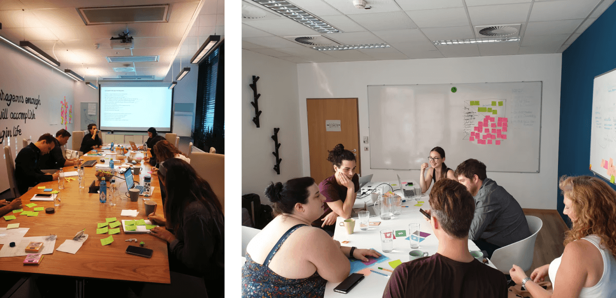


6 nationalities were represented in our team. We organised two 3-day-long workshops together, one in Oslo and one in Budapest.
Research
Our UX researcher started with Google Analytics reports and a couple of interviews for the existing website. Having data from analytics and the interviews helped us understand the target audience's main pain points in the beginning.
After that, she started conducting usability tests on the early prototype. She tested with people from all around the world currently studying in Budapest and looking for a place where they can do a Master's degree. Testing the evolving and expanding prototype, she collected more than 1300 observations. All organized in a cross-filterable Airtable research system.
Design
Design
Design
Design
Ideation
Our UX researcher started with Google Analytics reports and a couple of interviews for the existing website. Having data from analytics and the interviews helped us understand the target audience's main pain points in the beginning.
After that, she started conducting usability tests on the early prototype. She tested with people from all around the world currently studying in Budapest and looking for a place where they can do a Master's degree. Testing the evolving and expanding prototype, she collected more than 1300 observations. All organized in a cross-filterable Airtable research system.
Wireframes
We collaborated in collaborated in Axure with my designer peer. Since we were testing both mobile and desktop versions, we divided the work by these two platform types in an offset manner so we made sure we are not designing the same features at the same time. This provided the benefit of being able to work independently while keeping consistency through daily check-ins.
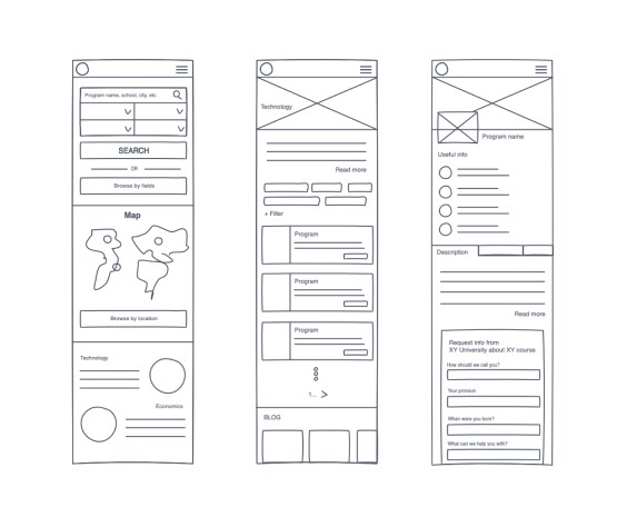


Early wireframes of Home screen & Search results & Details page
UI design
After having validated the most important user journeys in Axure, we migrated to work in Figma, which allows for amazing real-time collaboration. We kept dividing the work between us by platforms but kept collaborating very closely, always aware of what the other is working on. We planned on how and when we want to execute certain features and made sure that we have a slight offset between the two designers, so we don't design different solutions for the same page.
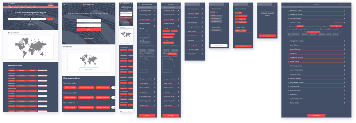

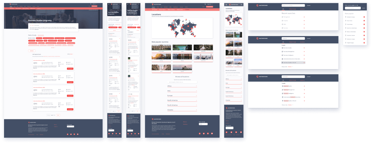

Some examples of the countless states and variations we have delivered.
Improved filtering and search capabilities
User problem
Hard to make sense of all the available categories. They are numerous and sometimes overlapping. It makes browsing between them not as efficient as users expect it to be.
User problem
Hard to make sense of all the available categories. They are numerous and sometimes overlapping. It makes browsing between them not as efficient as users expect it to be.
User problem
Hard to make sense of all the available categories. They are numerous and sometimes overlapping. It makes browsing between them not as efficient as users expect it to be.
User problem
Hard to make sense of all the available categories. They are numerous and sometimes overlapping. It makes browsing between them not as efficient as users expect it to be.
Business/Tech Challenge
To maximize SEO, discipline (category) and field of study (sub-category) names were very detailed and redundant. Too many definitions that are overlapping resulted in an overwhelming amount of options to choose from.
Business/Tech Challenge
To maximize SEO, discipline (category) and field of study (sub-category) names were very detailed and redundant. Too many definitions that are overlapping resulted in an overwhelming amount of options to choose from.
Business/Tech Challenge
To maximize SEO, discipline (category) and field of study (sub-category) names were very detailed and redundant. Too many definitions that are overlapping resulted in an overwhelming amount of options to choose from.
Business/Tech Challenge
To maximize SEO, discipline (category) and field of study (sub-category) names were very detailed and redundant. Too many definitions that are overlapping resulted in an overwhelming amount of options to choose from.
Solution
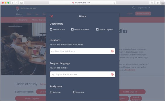
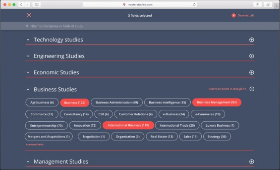
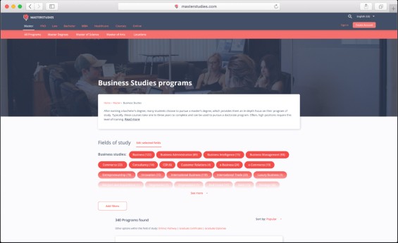
We applied progressive disclosure to make filtering less overwhelming by showing only the disciplines first. On the other hand, it is also possible to custom select from multiple categories, which increases flexibility.
Solution
We applied progressive disclosure to make filtering less overwhelming by showing only the disciplines first. On the other hand, it is also possible to custom select from multiple categories, which increases flexibility.
Solution
We applied progressive disclosure to make filtering less overwhelming by showing only the disciplines first. On the other hand, it is also possible to custom select from multiple categories, which increases flexibility.
Solution
We applied progressive disclosure to make filtering less overwhelming by showing only the disciplines first. On the other hand, it is also possible to custom select from multiple categories, which increases flexibility.
Browsing and filtering both have dedicated user flows now.
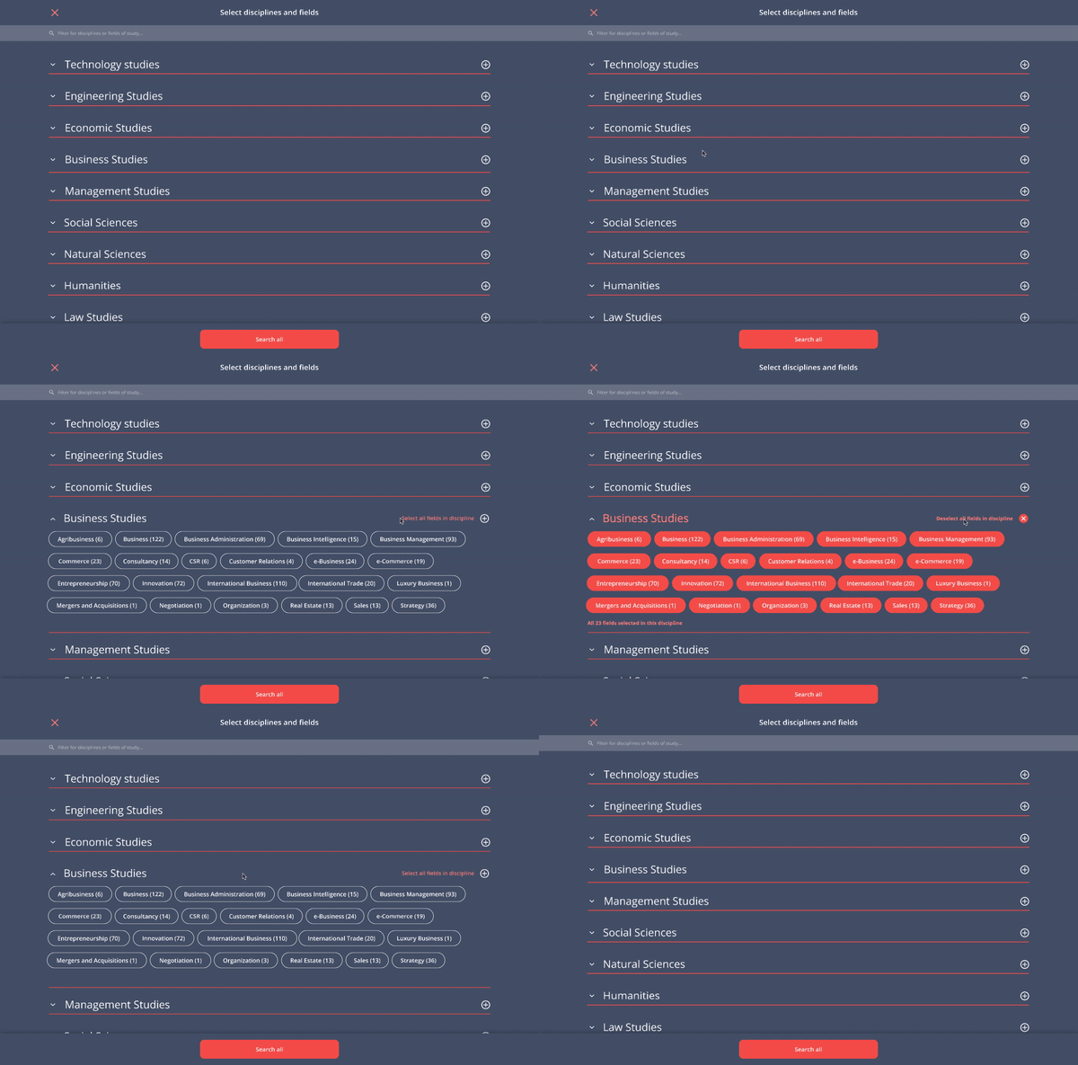


Animation made in Principle to show desired functioning.
Details page template redesign
User problem
Since each program page was structured differently, information was hard to scan.
User problem
Since each program page was structured differently, information was hard to scan.
User problem
Since each program page was structured differently, information was hard to scan.
User problem
Since each program page was structured differently, information was hard to scan.
Business/Tech Challenge
Providing custom made structure for hundreds of pages cost a lot of time and money.
Business/Tech Challenge
Providing custom made structure for hundreds of pages cost a lot of time and money.
Business/Tech Challenge
Providing custom made structure for hundreds of pages cost a lot of time and money.
Business/Tech Challenge
Providing custom made structure for hundreds of pages cost a lot of time and money.
Solution
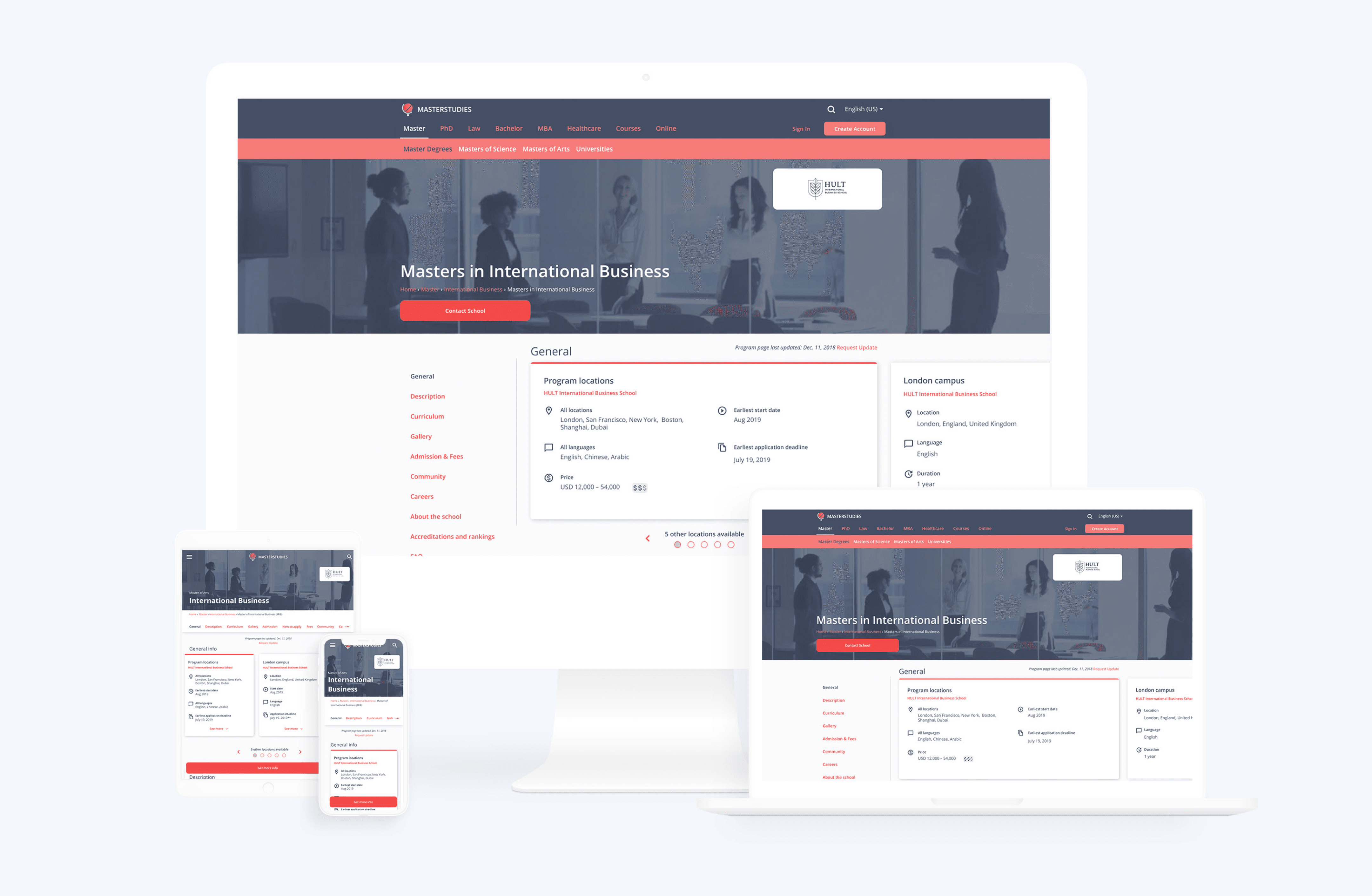
After several user interviews, we identified the critical information students were looking for when searching for a degree. Based on this information, we came up with a template and a navigation system.
Re-thinking the layout was a good investment in the long run: the easier students find the necessary information, the more likely they contact the school.
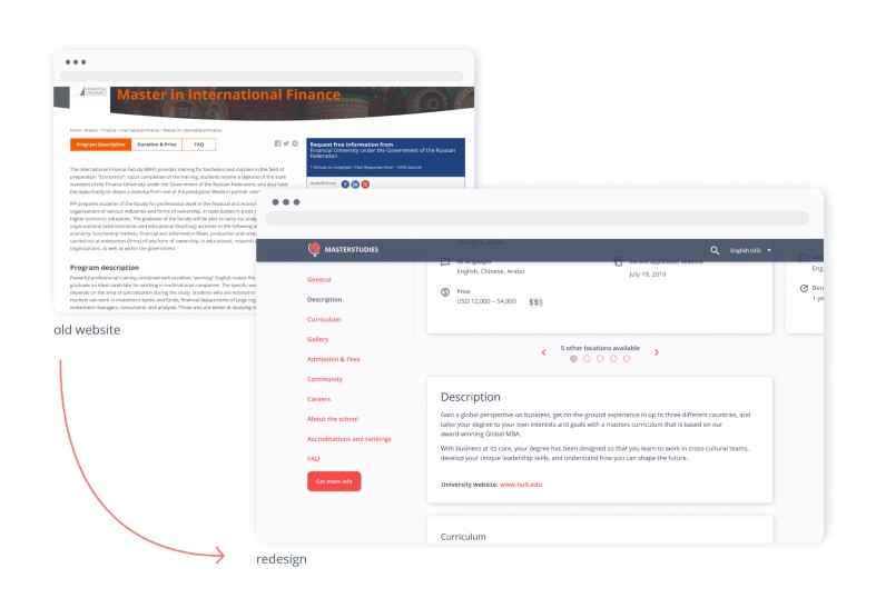


Finding the right moment to ask for data
User problem
It’s hard to find the right contact person from the institution.
User problem
It’s hard to find the right contact person from the institution.
User problem
It’s hard to find the right contact person from the institution.
User problem
It’s hard to find the right contact person from the institution.
Business/Tech Challenge
Regardless of its prominent place, not enough people wanted to fill out the contact form.
Business/Tech Challenge
Regardless of its prominent place, not enough people wanted to fill out the contact form.
Business/Tech Challenge
Regardless of its prominent place, not enough people wanted to fill out the contact form.
Business/Tech Challenge
Regardless of its prominent place, not enough people wanted to fill out the contact form.
Solution
When entering a program page, users are not likely to fill out a form without checking the program details. They also wanted to understand where their information was being sent to. Changing the title and moving the form to the bottom of the page made the site feel more trustworthy.
Solution
When entering a program page, users are not likely to fill out a form without checking the program details. They also wanted to understand where their information was being sent to. Changing the title and moving the form to the bottom of the page made the site feel more trustworthy.
Solution
When entering a program page, users are not likely to fill out a form without checking the program details. They also wanted to understand where their information was being sent to. Changing the title and moving the form to the bottom of the page made the site feel more trustworthy.
Solution
When entering a program page, users are not likely to fill out a form without checking the program details. They also wanted to understand where their information was being sent to. Changing the title and moving the form to the bottom of the page made the site feel more trustworthy.
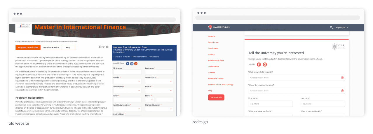


Localization - 44 languages without major UI modifications
User problem
It's easier to understand and share information in your native language than in English.
User problem
It's easier to understand and share information in your native language than in English.
User problem
It's easier to understand and share information in your native language than in English.
User problem
It's easier to understand and share information in your native language than in English.
Business/Tech Challenge
Different languages have different constraints (average word length, reading direction, translation costs, etc.)
Business/Tech Challenge
Different languages have different constraints (average word length, reading direction, translation costs, etc.)
Business/Tech Challenge
Different languages have different constraints (average word length, reading direction, translation costs, etc.)
Business/Tech Challenge
Different languages have different constraints (average word length, reading direction, translation costs, etc.)
Solution
From day one, we prepared for this challenge and planned the interface accordingly. In the UI phase, we also tested our designs in different languages (e.g., German, Arabic, Japanese).
Solution
From day one, we prepared for this challenge and planned the interface accordingly. In the UI phase, we also tested our designs in different languages (e.g., German, Arabic, Japanese).
Solution
From day one, we prepared for this challenge and planned the interface accordingly. In the UI phase, we also tested our designs in different languages (e.g., German, Arabic, Japanese).
Solution
From day one, we prepared for this challenge and planned the interface accordingly. In the UI phase, we also tested our designs in different languages (e.g., German, Arabic, Japanese).
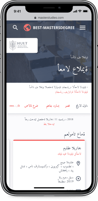
Arabic translation of a program page.
Conclusion
We're thrilled to work on this project and had a lot of fantastic feedback and support from the team in Oslo. This case study was the summary of the first three months of our collaboration. In the second phase of the project, we concentrated on creating a user dashboard and student to university messaging and notification system.
Bridging online and offline product experience
Can Blueair have a better App Strore rating?

Consumer experience
Product strategy
Design system
2020
10 minutes to read
Augmented reality platform
Making digital fashion more meaningful.

Product strategy
MVP
Engagement
2024
7 minutes to read

Converting users with different backgrounds
Web2.5 payment and account flow
Design
Research
Product strategy
2023
7 minutes to read
Onboarding novice traders
Promising crypto startup preparing for growth.

Design
Research
Product strategy
2020
10 minutes to read
Product culture
Transforming a startup that worked as an agency to an organisation that places product & customers in the centre.
EdTech
CRO
Multi -language
2023
5 minutes to read

Bridging online and offline product experience
Can Blueair have a better App Strore rating?

Consumer experience
Product strategy
Design system
2020
10 minutes to read
Augmented reality platform
Making digital fashion more meaningful.

Product strategy
MVP
Engagement
2024
7 minutes to read

Converting users with different backgrounds
Web2.5 payment and account flow
Design
Research
Product strategy
2023
7 minutes to read
Onboarding novice traders
Promising crypto startup preparing for growth.

Design
Research
Product strategy
2020
10 minutes to read
Product culture
Transforming a startup that worked as an agency to an organisation that places product & customers in the centre.
EdTech
CRO
Multi -language
2023
5 minutes to read

Bridging online and offline product experience
Can Blueair have a better App Strore rating?

Consumer experience
Product strategy
Design system
2020
10 minutes to read
Augmented reality platform
Making digital fashion more meaningful.

Product strategy
MVP
Engagement
2024
7 minutes to read

Converting users with different backgrounds
Web2.5 payment and account flow
Design
Research
Product strategy
2023
7 minutes to read
Onboarding novice traders
Promising crypto startup preparing for growth.

Design
Research
Product strategy
2020
10 minutes to read
Product culture
Transforming a startup that worked as an agency to an organisation that places product & customers in the centre.
EdTech
CRO
Multi -language
2023
5 minutes to read

Bridging online and offline product experience
Can Blueair have a better App Strore rating?

Consumer experience
Product strategy
Design system
2020
10 minutes to read
Augmented reality platform
Making digital fashion more meaningful.

Product strategy
MVP
Engagement
2024
7 minutes to read

Converting users with different backgrounds
Web2.5 payment and account flow
Design
Research
Product strategy
2023
7 minutes to read
Onboarding novice traders
Promising crypto startup preparing for growth.

Design
Research
Product strategy
2020
10 minutes to read
Product culture
Transforming a startup that worked as an agency to an organisation that places product & customers in the centre.
EdTech
CRO
Multi -language
2023
5 minutes to read


Bridging online and offline product experience
Can Blueair have a better App Strore rating?
Consumer experience
Product strategy
Design system

Augmented reality platform
Converting users with different technological backgrounds
Product strategy
MVP
Engagement
Onboarding novice traders
Promising crypto startup preparing for growth.
Crypto
Trading
Growth


Converting users with different backgrounds
Web2.5 payment and account flow
Personas
Research
User maturity
Product culture
Transforming a startup that worked as an agency to an organisation that places product & customers in the centre.

Scrum
Leadership
Strategy

Bridging online and offline product experience
Can Blueair have a better App Strore rating?
Consumer experience
Product strategy
Design system

Augmented reality platform
Converting users with different technological backgrounds
Product strategy
MVP
Engagement
Onboarding novice traders
Promising crypto startup preparing for growth.
Crypto
Trading
Growth


Converting users with different backgrounds
Web2.5 payment and account flow
Personas
Research
User maturity
Product culture
Transforming a startup that worked as an agency to an organisation that places product & customers in the centre.

Scrum
Leadership
Strategy

Bridging online and offline product experience
Can Blueair have a better App Strore rating?
Consumer experience
Product strategy
Design system

Augmented reality platform
Converting users with different technological backgrounds
Product strategy
MVP
Engagement
Onboarding novice traders
Promising crypto startup preparing for growth.
Crypto
Trading
Growth


Converting users with different backgrounds
Web2.5 payment and account flow
Personas
Research
User maturity
Product culture
Transforming a startup that worked as an agency to an organisation that places product & customers in the centre.

Scrum
Leadership
Strategy

Bridging online and offline product experience
Can Blueair have a better App Strore rating?
Consumer experience
Product strategy
Design system

Augmented reality platform
Converting users with different technological backgrounds
Product strategy
MVP
Engagement
Onboarding novice traders
Promising crypto startup preparing for growth.
Crypto
Trading
Growth


Converting users with different backgrounds
Web2.5 payment and account flow
Personas
Research
User maturity
Product culture
Transforming a startup that worked as an agency to an organisation that places product & customers in the centre.

Scrum
Leadership
Strategy
More projects

Get in touch
Copy to clipboard
atsomos@gmail.com
+31683291846

Get in touch
Copy to clipboard
atsomos@gmail.com
+31683291846

Copy to clipboard
atsomos@gmail.com
+31683291846
Get in touch

Get in touch
Copy to clipboard
atsomos@gmail.com
+31683291846

